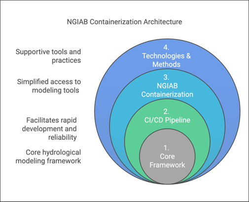
Image 1 of 1: ‘A concentric circle diagram titled "NGIAB Containerization Architecture." It consists of four nested layers representing different components. At the center is "1. Core Framework" in gray, symbolizing the core hydrological modeling framework. Surrounding it is "2. CI/CD Pipeline" in green, representing tools that facilitate rapid development and reliability. The next layer is "3. NGIAB Containerization" in blue, indicating simplified access to modeling tools. The outermost layer is "4. Technologies & Methods" in dark blue, representing supportive tools and practices. Labels on the left of the diagram describe the increasing level of support from the core outward.’
Figure 1: Architecture of the NGIAB,
highlighting its core modeling foundation, CI/CD pipelines,
containerized tools and supporting technologies.
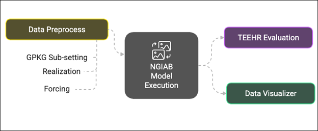
Figure 2
Image 1 of 1: ‘A flowchart diagram showing the NGIAB model execution process. The central box labeled "NGIAB Model Execution" is connected to three components. To the left is a yellow-green box labeled "Data Preprocess," with three subcomponents listed: "GPKG Sub-setting," "Realization," and "Forcing." To the right, two boxes are connected to the center: a purple box labeled "TEEHR Evaluation" and a green box labeled "Data Visualizer." Dashed arrows indicate the flow of data between preprocessing, model execution, and evaluation/visualization.’
Figure 2: Workflow of data acquisition, model
execution, evaluation, and results visualization.
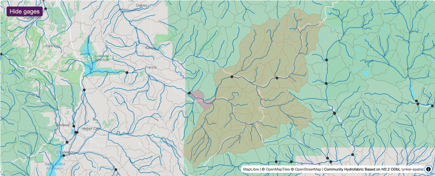
Figure 3
Image 1 of 1: ‘A map view displaying the Provo River network and basin boundaries in the area around Woodland, UT. The map includes the stream network shown in blue, basin boundaries in orange shaded regions, the downstream-most basin in a pink shaded reagion, and black dots representing USGS gage locations.’
Figure 3: Map showing the drainage basin used as
our demonstration case, the Provo River near Woodland, UT
(Gage-10154200). This view shows the NGIAB interactive preprocessing
tool. The highlighted region (light orange area; downstream-most basin
in pink) represents the specific study basin, illustrating the river
network (blue lines), sub-basins (orange), and surrounding USGS gaging
stations (black dots).
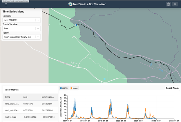
Figure 4
Image 1 of 1: ‘A screenshot of the NextGen in a Box Visualizer web interface. The left panel contains a "Time Series Menu" where the user can select a Nexus ID, variable (e.g., flow), and TEEHR data source. A map in the center displays a stream reach with a highlighted section representing the drainage basin and a blue point, indicating the selected nexus location. Below the map, a time series plot compares USGS (blue line) and Ngen (orange line) streamflow data from 2017 to 2023. On the lower left, a table labeled "Teehr Metrics" presents performance metrics (e.g., Kling-Gupta Efficiency, Nash-Sutcliffe Efficiency, and Relative Bias) for the selected model versus reference data.’
Figure 4: Map showing the geospatial
visualization using the Data Visualizer for a selected outlet point as
well as displaying a time series plot between observed (labeled “USGS”;
blue line) and simulated (labeled “ngen”; orange line) with the
performance metrics (Kling-Gupta Efficiency (KGE), Nash-Sutcliffe
Efficiency (NSE), and relative bias). These metrics assess how closely
simulated results match observed data. The Visualizer can also show the
performance of the NWM 3.0 compared to the observed time series.
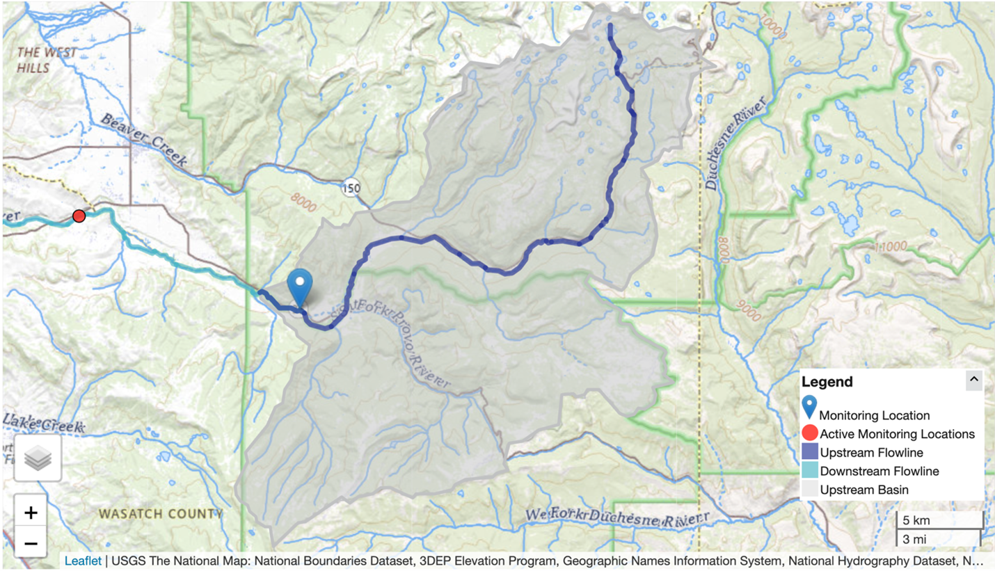
Image 1 of 1: ‘A screenshot of the USGS National Map centered on the Provo River network in Utah, showing streamflow and watershed data. A blue map marker identifies a Monitoring Location. A red dot marks an Active Monitoring Location farther downstream. The Upstream Basin is shaded in grey, while Upstream Flowlines and Downstream Flowlines are highlighted in dark and light blue, respectively. A scale bar in the bottom right shows distances of 5 kilometers and 3 miles. A map legend in the lower right corner explains the color codes for flowlines and monitoring locations.’
Figure 1: Map showing an example drainage basin.
View from the USGS National Map.
Figure 2
Image 1 of 1: ‘A map view displaying the Provo River network and basin boundaries in the area around Woodland, UT. The map includes the stream network shown in blue, basin boundaries in orange shaded regions, the downstream-most basin in a pink shaded reagion, and black dots representing USGS gage locations.’
Figure 2: Map showing an example drainage basin.
View from the Data Preprocess tool. The highlighted region (light orange
area; downstream-most basin in pink) represents the specific study
basin, illustrating the river network (blue lines), sub-basins (orange),
and surrounding USGS gaging stations (black dots).
Image 1 of 1: ‘A hydrograph spanning years 2017-2022. The x-axis is labeled "Datetime", and the y-axis is labeled "streamflow_hourly inst [m^3/s]". The blue line represents the NextGen run (labeled "ngen"), and the orange line represents the NWM 3.0 time series (labeled "nwm30_retrospective"). A legend is in the upper-right corner explaining the colors of these lines.’
Figure 1: Comparison of the NextGen-based model
(labeled “ngen”; blue line) and the NWM time series (labeled
“nwm30_retrospective”; orange line) for the same location. The figure is
automatically generated by the TEEHR-based analysis that accompanies the
guide.sh script included with NGIAB and is named
timeseries_plot_streamflow_hourly_inst.html in the
teehr folder.
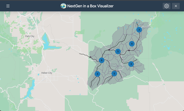
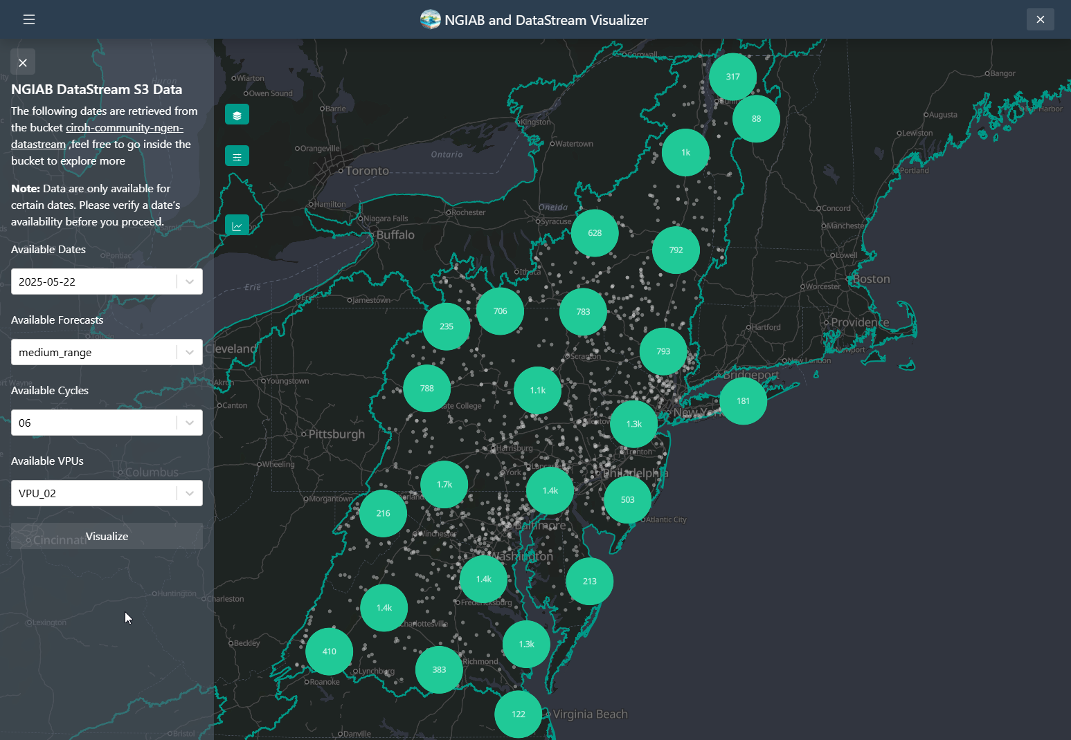
Image 1 of 1: ‘A screenshot of the NGIAB and DataStream Visualizer web interface. The map displays a the Provo River basin network near Woodland, UT. The gray shaded area represents the basin, dark gray lines represent catchment boundaries, black lines represent major streams, and blue circles with numbers in the middle represent the number of nexus points near that circle.’
Figure 1: A map showing the geospatial
visualization using the Data Visualizer within the Tethys framework for
an entire study area (Provo River near Woodland, UT).
Figure 2
Image 1 of 1: ‘A screenshot of the NGIAB and DataStream Visualizer web interface. The map displays the ability of the visualizer to use multiple outputs’
Figure 2: NGIAB Visualizer dropdown for multiple
outputs
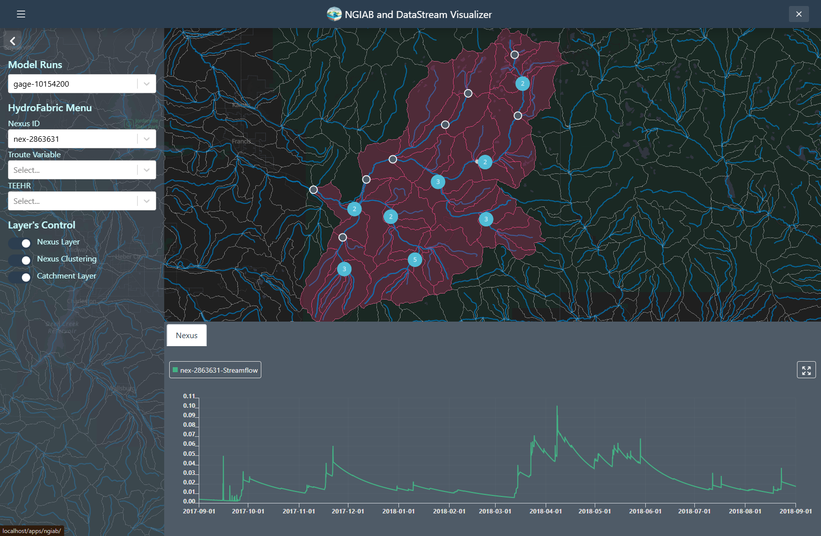
Figure 3
Image 1 of 1: ‘A screenshot of the NGIAB and DataStream Visualizer web interface. The map displays the ability of the visualizer to retrieve time series from Nexus points’
Figure 3: NGIAB Visualizer time series
visualization from Nexus points
Figure 4
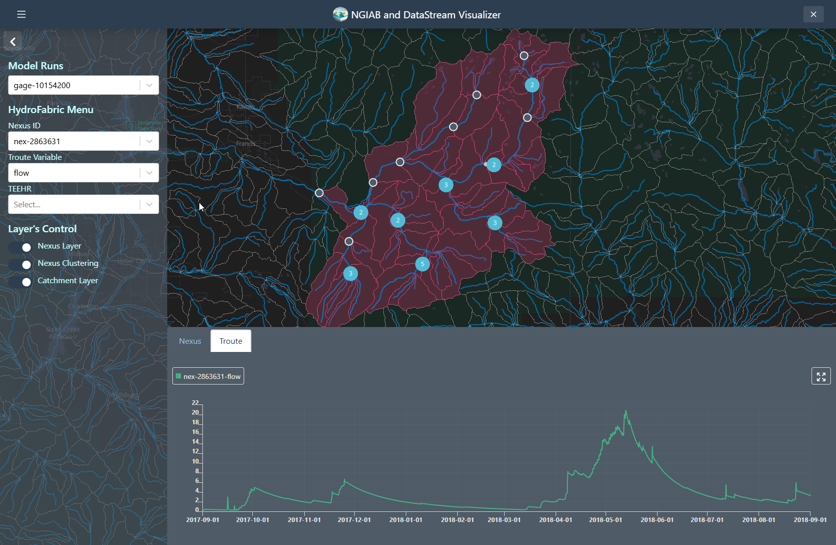
Image 1 of 1: ‘A screenshot of the NGIAB and DataStream Visualizer web interface. The map displays the ability of the visualizer to retrieve time series from Troute variables’
Figure 4: NGIAB Visualizer time series
visualization from Troute variables
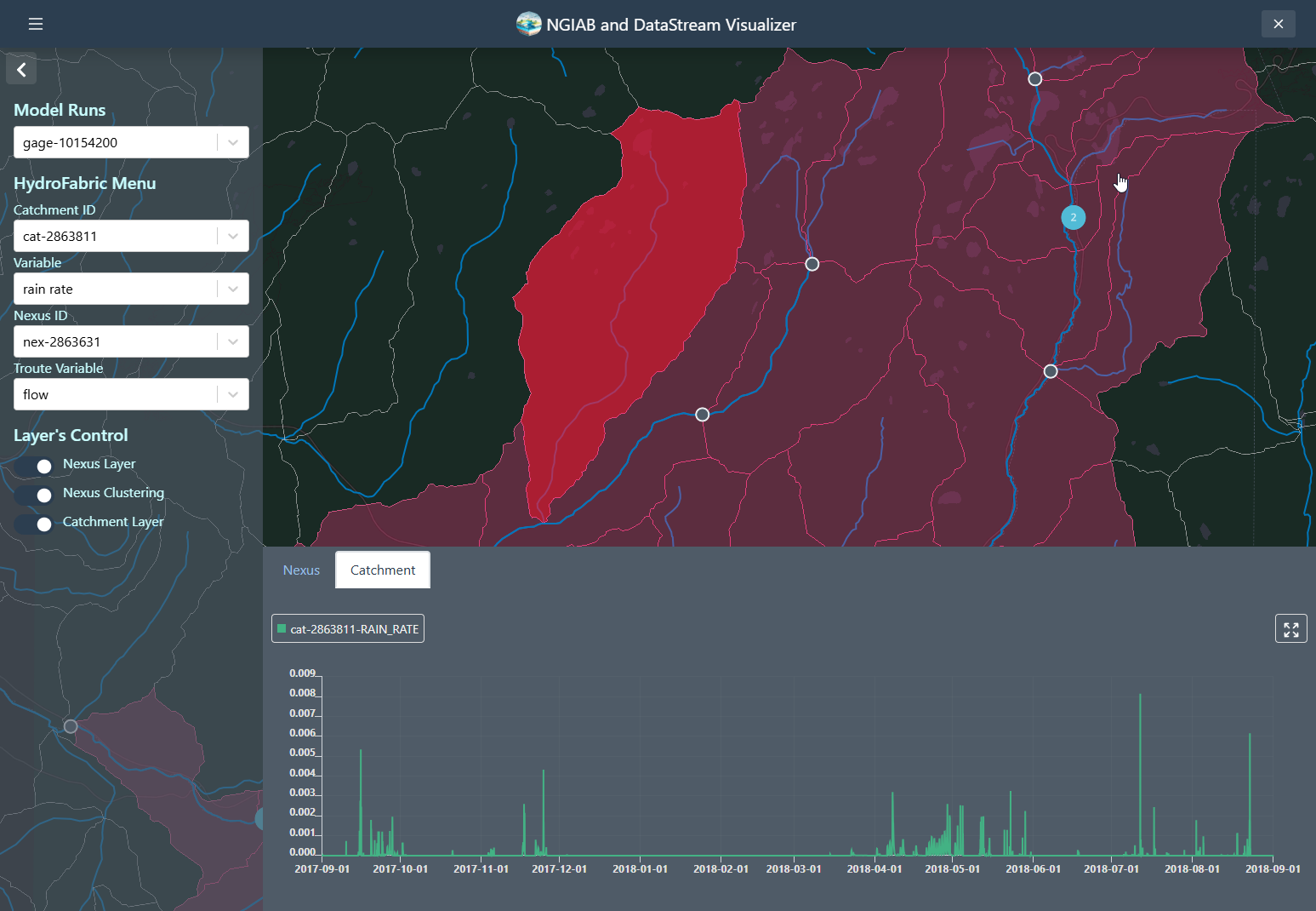
Figure 5
Image 1 of 1: ‘A screenshot of the NGIAB and DataStream Visualizer web interface. The map displays the ability of the visualizer to retrieve time series from Catchments variables’
Figure 5: NGIAB Visualizer time series
visualization for Catchments
Figure 6
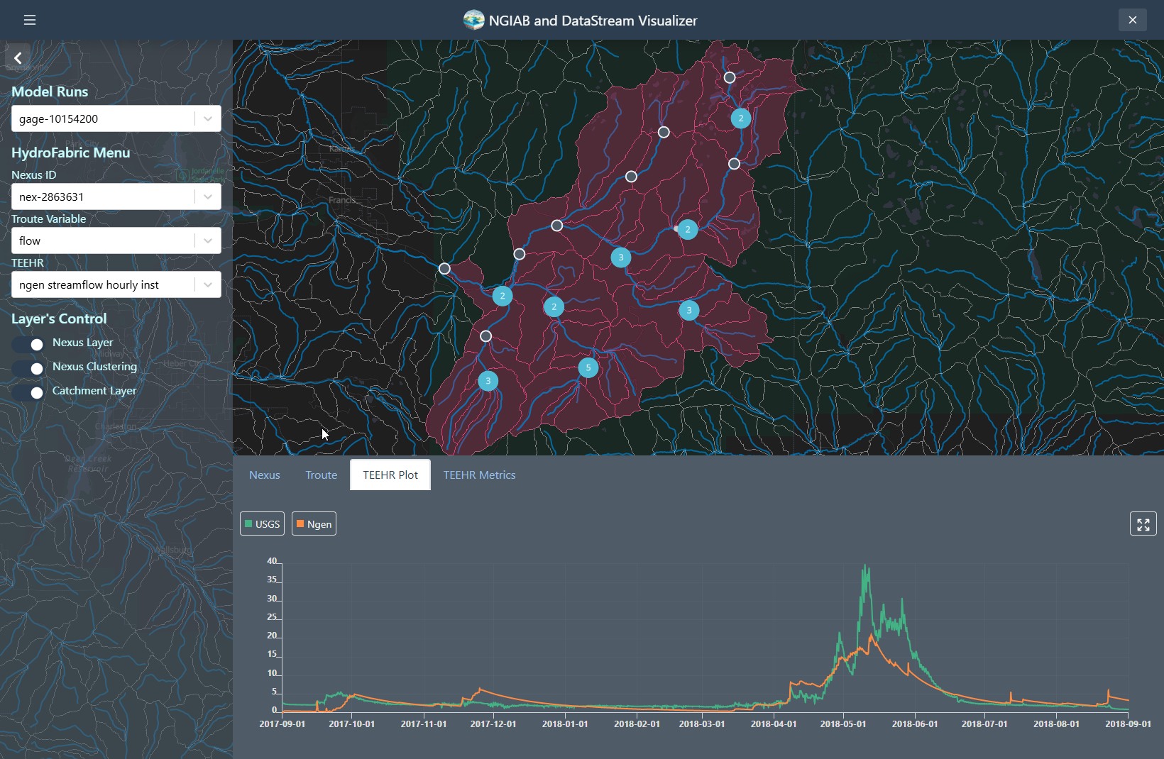
Image 1 of 1: ‘A screenshot of the NGIAB and DataStream Visualizer web interface. The left panel contains a "Time Series Menu" where the user can select a Nexus ID, variable (e.g., flow), and TEEHR data source. A map in the center displays a stream reach with a highlighted section representing the drainage basin and a blue point, indicating the selected nexus location. Below the map, a time series plot compares USGS (blue line) and Ngen (orange line) streamflow data from 2017 to 2023.’
Figure 6: A map showing the geospatial
visualization using the Data Visualizer within the Tethys framework for
a selected outlet nexus point as well as displaying a time series plot
between observed (labeled “USGS”; blue line) and simulated (labeled
“ngen”; orange line)
Figure 7
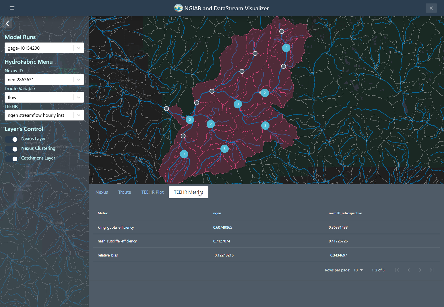
Image 1 of 1: ‘A screenshot of the NGIAB and DataStream Visualizer web interface. The map displays the ability of the visualizer to retrieve the TEEHR metrics on a table."Teehr Metrics" presents performance metrics (e.g., Kling-Gupta Efficiency, Nash-Sutcliffe Efficiency, and Relative Bias) for the selected model versus reference data.’
Figure 7: NGIAB Visualizer performance metrics
(KGE, NSE, and relative bias). The Visualizer can also show the
performance of the NWM 3.0 compared to the observed time series.
Figure 8
Image 1 of 1: ‘A screenshot of the NGIAB and DataStream Visualizer web interface displaying the hydrofabric for DataStream output’
Figure 8: NGIAB Visualizer Visualization of
DataStream Data
![A hydrograph spanning years 2017-2022. The x-axis is labeled "Datetime", and the y-axis is labeled "streamflow_hourly inst [m^3/s]". The blue line represents the NextGen run (labeled "ngen"), and the orange line represents the NWM 3.0 time series (labeled "nwm30_retrospective"). A legend is in the upper-right corner explaining the colors of these lines.](../fig/fig5-1.png)